
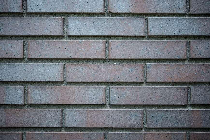
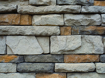
Detailed close-up of a red brick wall with visible mortar lines and weathered texture. Ideal for architectural backgrounds, construction themes, and industrial design projects.
Tags:
PHOTO INFO
- Image Size
- 5912x3947px
- File Size
- 8.74MB
- resolution
- 5K
- License
- Commercial use free
- Aesthetic Score
- 65/100
VISUAL ATTRIBUTES OF THIS STOCK PHOTO
- Color temperature
- neutral
- Brightness
- mid_tone
- Saturation
- muted
- Lighting Source
- natural
- Lighting Condition
- overcast
- Negative Space
- none
- Negative Space Location
- none
- Depth Of Field
- deep
- Has People
- none
- Season
- unknown
- Time Of Day
- unknown
- Shot Scale
- close_up
- Background Type
- textured
- Orientation
- horizontal
- Composition Style
- pattern
- Dominant colors
- redgraybrown
- Palette Style
- earthynatural
- Mood
- industrialraw
- Style
- documentaryarchitectural
- Subject type
- architecturebackground
aesthetic analysis & score
This is a competent and technically sound texture shot that serves its functional purpose well, but it lacks the distinctive lighting or unique character required to stand out in a crowded stock library.
Composition & Framing
75The tight, edge-to-edge framing effectively emphasizes the repetitive pattern and texture of the bricks.
Lighting & exposure
65The lighting is somewhat flat and diffuse, resulting in low contrast that minimizes the depth of the brick texture.
Color harmony & palette
70The muted reds and grays create a cohesive, earthy palette, though the colors appear slightly desaturated.
Visual impact & mood
55The visual impact is moderate as the subject is a common texture that lacks a unique or striking artistic element.
Technical Quality & Clarity
80The image is sharp and clear, capturing the granular details of the brick surface and mortar lines effectively.
Subject clarity & focal hierarchy
85The subject is unambiguous, with the entire frame dedicated to the brick pattern without any distracting elements.
Use case suitability scores
Copyspace Layout Usability
85This image is suitable for text overlay layouts — the negative space in the all area works for posters, banners, greeting cards and magazine covers needing headline room
Social Media Content Creation
45Web UI Digital Design
75Commercial Advertising Branding
60Editorial Corporate Presentation
70Content Marketing Publishing
75Ecommerce Product Showcase
20Market Competitiveness
60Related Royalty free Photos
-
aesthetic:80
2800x1867px
Close-up of red brick wall texture with white mortar -
aesthetic:72
2800x1867px
Red Brick Wall Texture Background -
aesthetic:78
5184x3456px
Textured Stone Brick Wall Background Pattern -
aesthetic:82
4552x3015px
Vintage Red Brick Wall Texture Background -
aesthetic:72
5184x3456px
Textured Red Brick Wall Background -
aesthetic:80
1152x1533px
Textured Red Brick Wall Background with White Mortar -
aesthetic:72
4057x2728px
Red Brick Wall Texture with Gray Mortar Joints -
aesthetic:75
4711x3140px
Textured Red Brick Wall with Green Grass Background -
aesthetic:78
4288x2848px
Textured gray stone wall background with rough surface -
aesthetic:82
3333x5000px
Textured Red Brick Wall Background with Weathered Grout -
aesthetic:78
4000x6000px
Textured beige stone wall background with horizontal masonry pattern -
aesthetic:82
4553x3419px
Red Brick Wall Texture Background -
aesthetic:72
2048x1536px
Gray Brick Wall Texture Background -
aesthetic:78
5760x3840px
Textured Brick Wall with Distressed Red Paint Stripe -
aesthetic:85
1920x1280px
Vibrant Orange and Purple Brick Wall Texture Background -
aesthetic:82
4000x2600px
Red Brick Wall Texture Background -
aesthetic:65
4000x2667px
Red brick stairs with metal railing and green plants -
aesthetic:82
4460x2973px
Yellow Painted Brick Wall Texture Background -
aesthetic:78
5891x3828px
Dark aged brick wall texture background -
aesthetic:75
4592x3448px
Textured gray concrete wall background with cracks -
aesthetic:82
5856x3936px
Textured Red Sandstone Brick Wall Background -
aesthetic:76
6000x4000px
Textured Concrete Blocks with Dappled Shadows -
aesthetic:78
5781x3790px
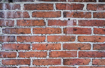
Close-up texture of old red brick wall with white mortar -
aesthetic:80
4066x2632px
Low angle view of red brick industrial building facade -
aesthetic:82
4032x3024px
Blue painted brick wall texture background -
aesthetic:82
5760x3840px
Weathered yellow square tile on old red brick wall texture -
aesthetic:82
1920x1280px
Black and white textured concrete wall pattern -
aesthetic:78
8078x5388px
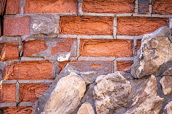
Close-up of weathered red brick and rough stone wall texture -
aesthetic:86
5239x3493px
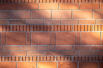
Textured Red Brick Wall with Sunlight Shadows -
aesthetic:88
4460x2973px
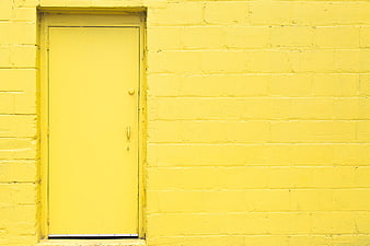
Minimalist Yellow Brick Wall with Matching Door -
aesthetic:78
1960x1306px
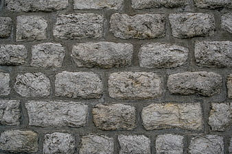
Rough gray stone wall texture background -
aesthetic:72
6016x4016px
Close-up of red brick wall texture with gray mortar -
aesthetic:78
4896x3264px
Close-up of weathered concrete wall with holes and cracks -
aesthetic:82
4326x3158px
Orange Brick Wall Texture Background -
aesthetic:76
4000x6000px
Textured Concrete Block Wall with Dappled Shadows -
aesthetic:78
2036x3335px
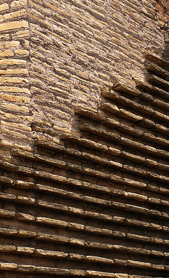
Textured Old Brick Wall Pattern Background -
aesthetic:75
4469x3356px
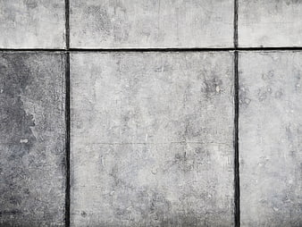
Textured gray concrete wall tiles with dark grout lines -
aesthetic:78
1920x1280px
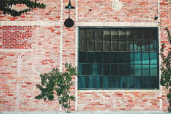
Vintage brick wall with large industrial window and green plants -
aesthetic:78
4032x3024px
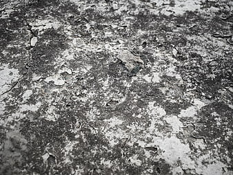
Close-up of weathered concrete texture with peeling paint -
aesthetic:78
4475x3356px
Red brick wall with bricked-up windows and stone sills -
aesthetic:82
4000x6000px
Old barred window in weathered brick wall -
aesthetic:80
5472x3648px
Red Brick Paver Texture Background -
aesthetic:72
1920x1280px
Textured Green and White Brick Wall Background -
aesthetic:78
4608x3072px
Close-up of red brick wall texture with shallow depth of field -
aesthetic:80
3000x2000px
Textured brick wall with climbing vines and gray plaster background -
aesthetic:72
3008x2000px
Close-up of cracked asphalt road surface texture -
aesthetic:78
5858x3911px
Weathered Red Brick Wall Texture Background -
aesthetic:82
5223x3482px
Spotted Deer Resting Against Red Brick Wall -
aesthetic:85
3456x5184px
Close-up of colorful graffiti on a textured brick wall -
aesthetic:78
2730x1391px
Textured stone and brick wall pattern background -
aesthetic:85
3233x4850px
Colorful Portuguese Street Door with Blue and Yellow Walls -
aesthetic:76
1920x1280px
Black and White Concrete Pipes Construction Texture -
aesthetic:82
4601x3452px
Abstract Black and White Concrete Wall Texture with Geometric Lines -
aesthetic:68
2730x1820px
Greenish stucco wall texture with uneven plaster surface -
aesthetic:76
1920x1280px
Black and white industrial wall with barred window and number 6 -
aesthetic:55
2730x1542px
Textured Stone and Brick Mosaic Wall Pattern -
aesthetic:78
5472x3648px
Close-up texture of rough grey granite rock surface -
aesthetic:55
3965x2643px
Cracked concrete sidewalk pavement texture background -
aesthetic:76
3611x4815px
Weathered Red Brick Wall with Stone and Metal Details -
aesthetic:78
4537x3360px
Textured stone wall with beige and orange rocks