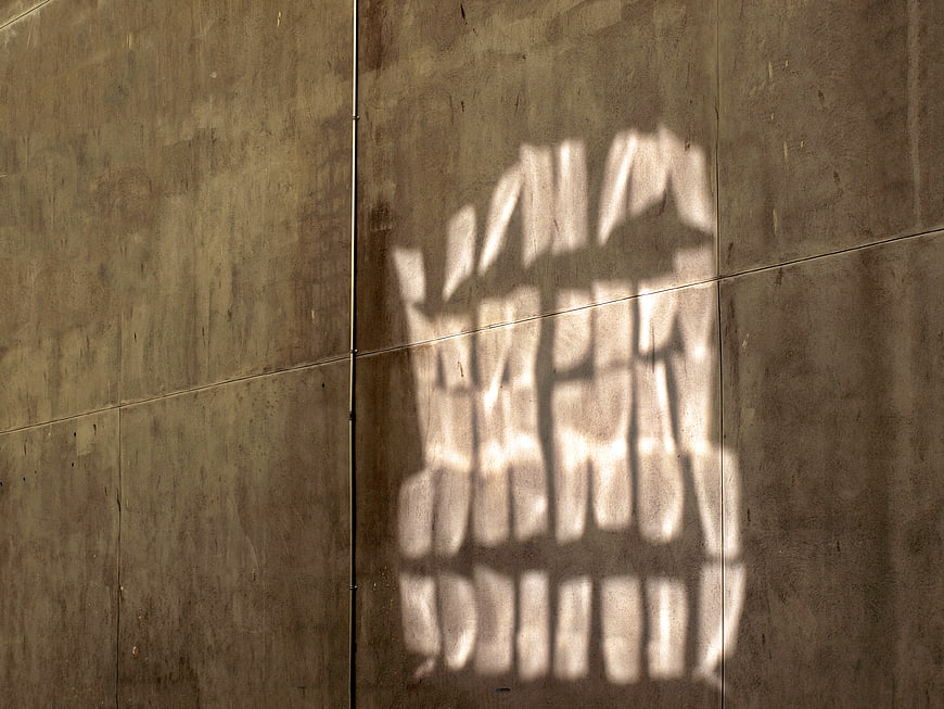
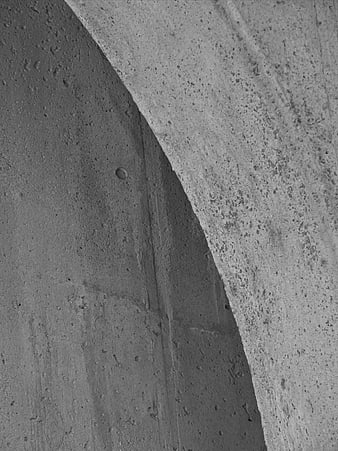
Minimalist architectural detail featuring a geometric shadow pattern cast by sunlight onto a textured concrete wall surface. Abstract interplay of light and shadow on building exterior.
Tags:
PHOTO INFO
- Image Size
- 3648x2736px
- File Size
- 3.2MB
- resolution
- 2K
- License
- Commercial use free
- Aesthetic Score
- 78/100
VISUAL ATTRIBUTES OF THIS STOCK PHOTO
- Color temperature
- warm_neutral
- Brightness
- mid_tone
- Saturation
- muted
- Lighting Source
- natural
- Lighting Condition
- midday
- Negative Space
- moderate
- Negative Space Location
- left
- Depth Of Field
- deep
- Has People
- none
- Season
- unknown
- Time Of Day
- afternoon
- Shot Scale
- medium
- Background Type
- textured
- Orientation
- horizontal
- Composition Style
- minimalpattern
- Dominant colors
- graybrownbeige
- Palette Style
- naturalearthy
- Mood
- calmminimalist
- Style
- minimalistabstractarchitectural
- Subject type
- architectureabstractpattern
aesthetic analysis & score
This is a strong, minimalist architectural detail shot that effectively uses light and texture to create visual interest. The composition is clean and the execution is technically proficient, making it a versatile asset for design projects requiring abstract or industrial elements.
Composition & Framing
75The off-center placement of the shadow creates a balanced asymmetry that draws the eye effectively across the textured surface.
Lighting & exposure
85The strong contrast between the bright sunlight and the darker concrete texture is well-exposed, highlighting the geometric pattern clearly.
Color harmony & palette
80The monochromatic palette of warm grays and browns creates a cohesive and understated visual harmony.
Visual impact & mood
70The minimalist aesthetic evokes a calm, contemplative mood, though the subject matter is somewhat abstract and subtle.
Technical Quality & Clarity
88The image is sharp and clear, capturing the fine details of the concrete texture and the crisp edges of the shadow.
Subject clarity & focal hierarchy
82The bright shadow pattern immediately establishes itself as the focal point against the darker, uniform background.
Use case suitability scores
Copyspace Layout Usability
85This image is suitable for text overlay layouts — the negative space in the left works for posters, banners, greeting cards and magazine covers needing headline room
Social Media Content Creation
65Web UI Digital Design
80Commercial Advertising Branding
70Editorial Corporate Presentation
75Content Marketing Publishing
70Ecommerce Product Showcase
40Market Competitiveness
75Related Royalty free Photos
-
aesthetic:82
4601x3452px
Abstract Black and White Concrete Wall Texture with Geometric Lines -
aesthetic:82
1920x1280px
Abstract Black and White Concrete Stairs with Railing Shadows -
aesthetic:88
3000x2000px
Abstract 3D Geometric Wall with Neon Gradient Lighting -
aesthetic:78
4000x6000px
Textured beige stone wall background with horizontal masonry pattern -
aesthetic:82
4460x2973px
Yellow Painted Brick Wall Texture Background -
aesthetic:84
6016x4016px
Modern wooden slat wall with curved architectural details -
aesthetic:91
3000x2000px
Minimalist Concrete Architecture with Sharp Shadows -
aesthetic:78
4437x3328px
Abstract Weathered Concrete Wall Texture with Vertical Lines -
aesthetic:84
1929x1446px
Abstract Geometric Metal Facade Pattern -
aesthetic:82
4752x3168px
Abstract Geometric Metal Diamond Pattern Texture Background -
aesthetic:82
2376x1584px
Abstract Geometric Concrete Wall Texture with Diagonal Lines -
aesthetic:82
5203x2977px
Geometric shadow pattern on horizontal window blinds -
aesthetic:82
4849x3637px
Abstract Blue Corrugated Metal Wall with Diagonal Beams -
aesthetic:75
4592x3448px
Textured gray concrete wall background with cracks -
aesthetic:85
4684x3112px

Abstract Blue Glass Building Facade with Diagonal White Reflection -
aesthetic:90
5184x2592px
Minimalist black and white concrete architecture with dramatic shadows -
aesthetic:88
6000x4000px
Abstract rusty metal texture with diagonal sunlight shadows -
aesthetic:82
3189x4814px
Blue Textured Wall with Geometric Ventilation Grille Pattern -
aesthetic:78
2637x3515px
Modern industrial building facade with ventilation details -
aesthetic:84
2718x3624px
Abstract Black and White Modern Architecture Concrete Texture -
aesthetic:91
5894x3935px
Colorful geometric building facade with yellow, white, and green tiles -
aesthetic:90
5760x3840px
Abstract Black and White Architectural Curves and Shadows -
aesthetic:78
2799x2099px
Abstract Geometric Glass Facade with Diagonal Metal Grid -
aesthetic:85
3000x2000px
Abstract Black and White Modern Architecture Curved Walls -
aesthetic:76
6000x4000px
Textured Concrete Blocks with Dappled Shadows -
aesthetic:75
5760x3840px
Dark Blue Textured Concrete Wall Background -
aesthetic:82
1920x1280px
Black and white textured concrete wall pattern -
aesthetic:88
7952x5304px
White geometric architectural facade with repeating pattern -
aesthetic:85
2650x3534px
Abstract Blue Geometric Facade with Gold Accents -
aesthetic:82
5421x3614px
Dark Geometric 3D Triangle Pattern Texture Background -
aesthetic:72
2634x3513px
Abstract architectural detail of concrete wall and window frame -
aesthetic:86
6016x4016px
Abstract Geometric Background with Colorful Paper Shapes -
aesthetic:88
4582x3055px
Abstract Geometric 3D Wall Pattern with Light and Shadow -
aesthetic:84
4828x3621px
Abstract Perforated Metal Wall Texture with Blue Light -
aesthetic:82
4211x2807px
Abstract White Diagonal Architectural Lines Pattern -
aesthetic:90
5184x3456px
Abstract White Wavy Modern Building Facade Architecture -
aesthetic:82
4472x2803px
Colorful striped architectural facade with red, yellow, and white panels -
aesthetic:78
2972x2229px
Modern gray concrete block building corner against blue sky -
aesthetic:78
3566x4761px
Abstract Corrugated Metal Wall Texture with Geometric Patterns -
aesthetic:82
3000x2000px
Modern wooden door and concrete block wall texture -
aesthetic:85
4968x3726px
Abstract modern building facade with pink and blue panels -
aesthetic:88
3888x5184px
Abstract Curved Corrugated Metal Roof with Shadows -
aesthetic:78
2736x3648px
Abstract Modern Architecture with Light and Shadow Patterns -
aesthetic:88
5760x3840px
Abstract geometric concrete architectural pattern -
aesthetic:78
4460x2974px
Modern Curved Glass Office Building Architecture -
aesthetic:78
4712x3534px
Modern geometric architecture with diamond pattern and concrete stairs -
aesthetic:85
1920x1280px
Black and white hexagonal metal mesh texture pattern -
aesthetic:88
3648x5472px
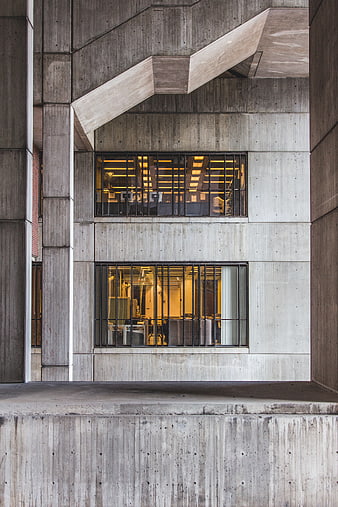
Modern Brutalist Concrete Building Facade with Lit Windows -
aesthetic:85
2448x1632px
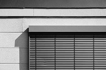
Black and white architectural detail of window blinds and wall -
aesthetic:90
3456x2304px
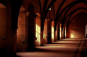
Sunlit Gothic Arches in Ancient Stone Hallway -
aesthetic:78
3615x5422px
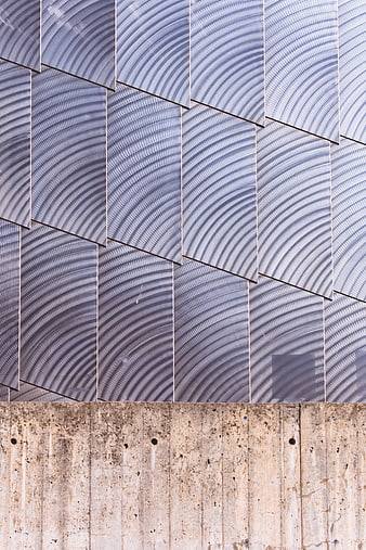
Modern architectural facade with textured metal panels and concrete base -
aesthetic:78
4896x3264px
Abstract architectural wall textures with tiles and concrete -
aesthetic:78
4288x2848px
Textured gray stone wall background with rough surface -
aesthetic:78
2548x1911px
Modern Green and Yellow Building Facade Abstract Pattern -
aesthetic:78
5184x3456px
Textured Stone Brick Wall Background Pattern -
aesthetic:82
2660x4000px
Modern Concrete and Glass Architecture Detail -
aesthetic:85
2400x1314px
Golden Hour Light on Dark Roof Tiles Pattern -
aesthetic:72
2403x3204px
Abstract Vertical Metal Wall Texture with Diagonal Seam -
aesthetic:88
4191x2794px
Vibrant yellow building facade with rustic wooden windows -
aesthetic:82
3888x5184px
Abstract Black and White Concrete Texture with Curved Shadow