
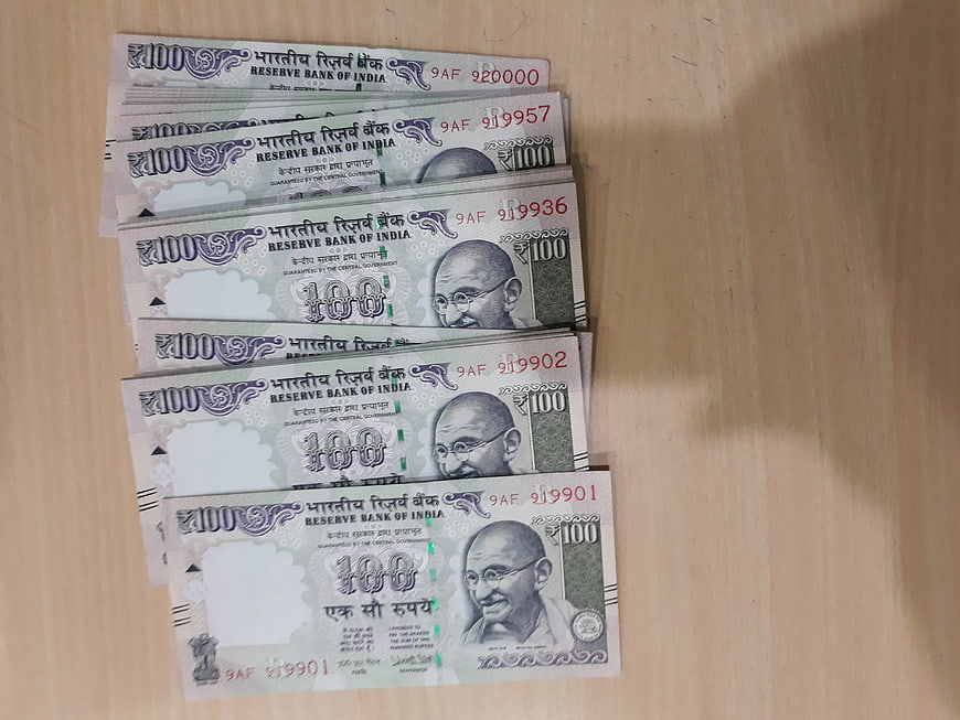
A neat stack of Indian 100 rupee banknotes featuring Mahatma Gandhi lies on a light wooden surface. This image captures Indian currency, finance, and savings concepts with clear details of the Reserve Bank of India notes.
Tags:
PHOTO INFO
- Image Size
- 4128x3096px
- File Size
- 1.78MB
- resolution
- 4K
- License
- Commercial use free
- Aesthetic Score
- 72/100
VISUAL ATTRIBUTES OF THIS STOCK PHOTO
- Color temperature
- neutral
- Brightness
- mid_tone
- Saturation
- moderate
- Lighting Source
- natural
- Lighting Condition
- indoor
- Negative Space
- moderate
- Negative Space Location
- right
- Depth Of Field
- deep
- Has People
- none
- Season
- unknown
- Time Of Day
- unknown
- Shot Scale
- close_up
- Background Type
- textured
- Orientation
- horizontal
- Composition Style
- diagonal
- Dominant colors
- greenbeigegray
- Palette Style
- natural
- Mood
- professional
- Style
- documentary
- Subject type
- finance
aesthetic analysis & score
This is a competent and clear stock image that effectively communicates the subject of Indian currency with good technical execution and a clean composition.
Composition & Framing
75The diagonal arrangement of the banknotes creates a dynamic visual flow and leads the eye through the stack effectively.
Lighting & exposure
70The lighting is functional and even, though slightly flat, ensuring all details on the currency are visible without harsh shadows.
Color harmony & palette
72The cool green and grey tones of the currency contrast pleasantly with the warm, neutral beige of the wooden surface.
Visual impact & mood
65The image conveys a straightforward, documentary feel suitable for financial topics but lacks strong artistic flair.
Technical Quality & Clarity
80The image is sharp and clear, allowing for easy reading of the text and serial numbers on the banknotes.
Subject clarity & focal hierarchy
85The stack of money is the undeniable focal point, clearly separated from the background with no distracting elements.
Use case suitability scores
Copyspace Layout Usability
85This image is suitable for text overlay layouts — the negative space in the right works for posters, banners, greeting cards and magazine covers needing headline room
Social Media Content Creation
70Web UI Digital Design
75Commercial Advertising Branding
65Editorial Corporate Presentation
80Content Marketing Publishing
75Ecommerce Product Showcase
40Market Competitiveness
70Related Royalty free Photos
-
aesthetic:85
4792x3174px

Green Piggy Bank, Calculator, and Glasses on White Wood -
aesthetic:82
6016x4016px
Top view of calculator, coins, glasses, and notebook on white wood -
aesthetic:72
4460x2975px
Scattered US Dollar Bills Close-Up -
aesthetic:80
5472x3648px
Stacks of Euro coins on a dark wooden table -
aesthetic:82
4460x2973px

Hand holding stack of hundred dollar bills on white background -
aesthetic:78
6016x4000px
Scattered 500 and 200 Euro Banknotes Close-Up -
aesthetic:78
4608x3456px
Close-up of United States One Dollar Bills -
aesthetic:78
4460x2976px
Close-up of mixed international coins and currency -
aesthetic:74
6000x4000px
Scattered Polish Zloty Coins on Wooden Table -
aesthetic:78
5247x3473px
Euro banknote house roof on stacks of coins -
aesthetic:85
4978x3323px
Falling Euro coins on wooden table -
aesthetic:65
4128x3096px
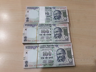
Stacks of Indian 100 Rupee Banknotes on Wooden Table -
aesthetic:78
5184x3456px
Hand holding rolled twenty dollar bill against dark trees -
aesthetic:78
6016x4016px
Close-up of mixed US coins including pennies and quarters -
aesthetic:82
3789x2521px
Hand holding two euro coin close up -
aesthetic:82
7719x5149px
Fan of US Twenty Dollar Bills on White Background -
aesthetic:78
6016x4000px
Close-up of 500 Euro Banknotes and Cash -
aesthetic:78
7015x4679px
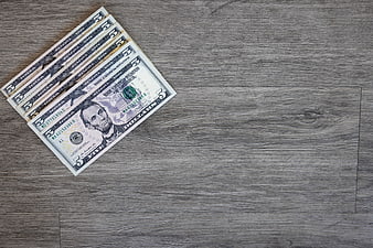
Stack of five dollar bills on gray wooden background -
aesthetic:78
3789x2521px
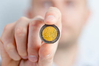
Hand holding two euro coin close up -
aesthetic:82
4634x3031px

Pink Piggy Bank with Euro Coins on White Background -
aesthetic:82
8192x5464px
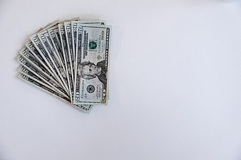
Fan of Twenty Dollar Bills on White Background -
aesthetic:72
4128x3096px
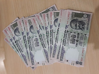
Fan of Indian 100 Rupee Notes on Wooden Table -
aesthetic:76
5456x3632px
Close-up of mixed Euro coins pile for finance concept -
aesthetic:82
2832x4256px

Hand Holding Two Euro Coin Close Up -
aesthetic:82
5836x3896px
Close-up of Alexander Hamilton on US Ten Dollar Bill -
aesthetic:72
5472x3648px
Hand holding Mastercard credit card in black and white -
aesthetic:72
3072x2048px
Silver briefcase filled with stacks of hundred dollar bills -
aesthetic:82
4732x3134px
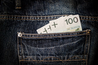
Polish Zloty Banknotes in Denim Jeans Pocket -
aesthetic:78
5836x3896px
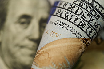
Close-up of rolled US one hundred dollar bill -
aesthetic:85
4460x2973px
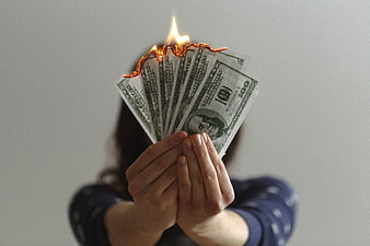
Hands holding burning hundred dollar bills -
aesthetic:75
4928x3264px

Economy spelled with letter tiles on US dollar bills -
aesthetic:72
5836x3896px
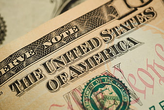
Close-up of United States Dollar Bill Text and Seal -
aesthetic:78
5222x3481px
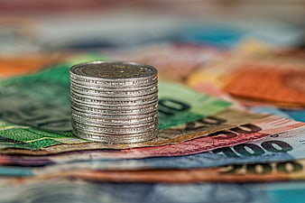
Stack of silver coins on colorful banknotes -
aesthetic:82
2973x4460px

Hand Holding Burning US Dollar Bills on White Background -
aesthetic:78
5836x3896px
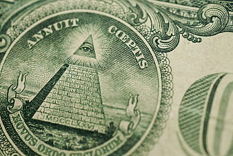
Close-up of Eye of Providence on US Dollar Bill -
aesthetic:76
5401x3064px
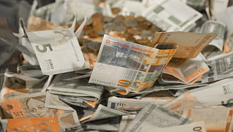
Pile of mixed European banknotes and coins -
aesthetic:85
5836x3896px
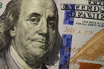
Close-up of Benjamin Franklin on US 100 Dollar Bill -
aesthetic:82
5836x3896px
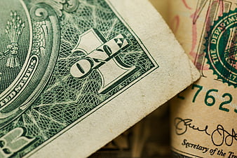
Close-up of US Dollar Bills and Currency -
aesthetic:88
2201x2201px

Euro Coins Falling on Wooden Surface -
aesthetic:72
4928x3264px
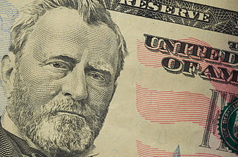
Close-up of Ulysses S. Grant on US Fifty Dollar Bill -
aesthetic:75
2496x1664px
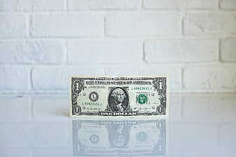
One Dollar Bill on White Brick Wall with Reflection -
aesthetic:78
4094x2769px
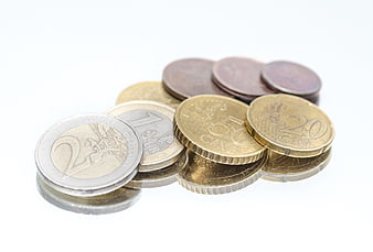
Euro coins on a reflective white surface -
aesthetic:72
4928x3264px
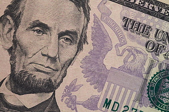
Close-up of US Five Dollar Bill with Lincoln Portrait -
aesthetic:78
4928x3264px
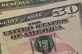
Close-up of United States Fifty Dollar Bill -
aesthetic:78
5836x3896px
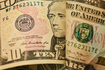
Close-up of United States Ten Dollar Bill -
aesthetic:75
5472x3648px
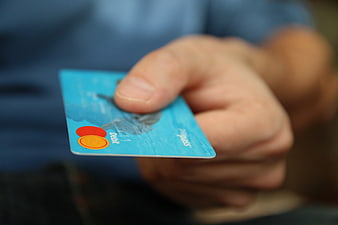
Hand holding blue Mastercard debit card close up -
aesthetic:78
4000x3000px
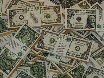
Stacks of One Dollar Bills Scattered on Surface -
aesthetic:76
2975x4460px
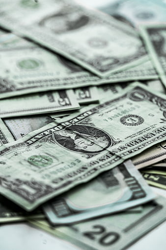
Close-up of scattered US dollar bills and cash currency -
aesthetic:82
3072x2048px
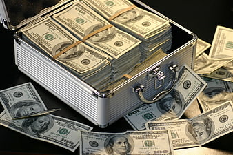
Open metal briefcase filled with stacks of hundred dollar bills -
aesthetic:82
5472x3648px

Stack of coins with blurred clock background -
aesthetic:82
4634x3031px

Pink Piggy Bank with Euro Coins on White Background -
aesthetic:78
4928x3264px
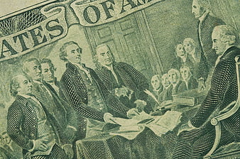
Close-up of US Two Dollar Bill Engraving -
aesthetic:78
4752x3168px
Pile of Euro Coins Background Texture -
aesthetic:75
5472x3080px
Close-up of Benjamin Franklin on a US Dollar Bill -
aesthetic:68
4523x3008px
Plastic pig figurine standing on US dollar bills -
aesthetic:72
4928x3264px
Close-up of US Two Dollar Bill Detail -
aesthetic:78
4961x3508px
Scattered One Dollar Bills with Dramatic Shadows -
aesthetic:82
3249x2016px
Old Leather Wallet with Euro Coins on White Background -
aesthetic:82
5836x3896px
Close-up of Benjamin Franklin on a worn US dollar bill -
aesthetic:72
5184x3456px
Rolled US Dollar Bills on White Background