
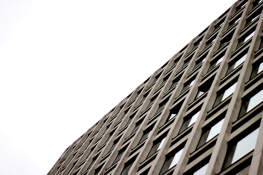
A dramatic low-angle shot of a modern office building facade featuring a repetitive grid of windows against a stark white sky. The architectural perspective emphasizes height and geometric patterns.
Tags:
PHOTO INFO
- Image Size
- 5184x3456px
- File Size
- 949.7KB
- resolution
- 5K
- License
- Commercial use free
- Aesthetic Score
- 78/100
VISUAL ATTRIBUTES OF THIS STOCK PHOTO
- Color temperature
- neutral
- Brightness
- high_key
- Saturation
- desaturated
- Lighting Source
- natural
- Lighting Condition
- overcast
- Negative Space
- large
- Negative Space Location
- top_left
- Depth Of Field
- deep
- Has People
- none
- Season
- unknown
- Time Of Day
- unknown
- Shot Scale
- wide
- Background Type
- solid_color
- Orientation
- horizontal
- Composition Style
- diagonal
- Dominant colors
- graywhite
- Palette Style
- monochrome
- Mood
- professionaldramatic
- Style
- architecturalminimalist
- Subject type
- architecturebuilding
aesthetic analysis & score
This is a strong architectural study that effectively uses perspective and pattern to create visual interest, though the flat lighting prevents it from reaching exceptional status.
Composition & Framing
85The strong diagonal composition creates a dynamic sense of scale and perspective, effectively utilizing the grid pattern to lead the eye.
Lighting & exposure
70The lighting is flat and diffuse, likely due to overcast conditions, which results in a lack of dramatic shadows but ensures even exposure across the facade.
Color harmony & palette
75The monochromatic palette of grays and whites creates a cohesive, minimalist aesthetic that emphasizes form over color.
Visual impact & mood
78The imposing perspective and stark contrast between the building and the sky create a powerful, somewhat austere visual impact.
Technical Quality & Clarity
80The image is sharp and clear, with good detail visible in the architectural elements and window reflections.
Subject clarity & focal hierarchy
85The building facade is the undeniable focal point, with the repetitive pattern creating a clear visual hierarchy that draws attention to the structure's geometry.
Use case suitability scores
Copyspace Layout Usability
90This image is suitable for text overlay layouts — the negative space in the top_left works for posters, banners, greeting cards and magazine covers needing headline room
Social Media Content Creation
65Web UI Digital Design
80Commercial Advertising Branding
70Editorial Corporate Presentation
85This image is suitable for editorial and corporate presentations — slide decks, annual reports, press releases, internal newsletters and conference presentation backgrounds
Content Marketing Publishing
75Ecommerce Product Showcase
20Market Competitiveness
75RELATED TAGS
Related Royalty free Photos
-
aesthetic:78
4928x3264px
Low angle view of modern skyscraper architecture against blue sky -
aesthetic:84
5472x3648px
Low angle view of modern glass skyscrapers against blue sky -
aesthetic:88
4990x3326px
Black and white low angle view of modern glass skyscraper architecture -
aesthetic:88
5157x3438px
Low angle view of modern glass skyscraper against cloudy sky -
aesthetic:90
5184x3456px
Low angle view of modern black skyscraper against white sky -
aesthetic:82
3072x2048px
Low angle view of modern skyscrapers against blue sky -
aesthetic:82
6000x4000px
Low angle view of modern brick apartment building facade -
aesthetic:82
4508x3005px
Low angle view of modern glass skyscraper reflecting clouds -
aesthetic:90
1595x1277px
Low angle view of modern skyscrapers in fog -
aesthetic:88
5517x3678px
Low angle view of modern skyscraper with cross-bracing -
aesthetic:78
3000x2000px
Modern Concrete Office Building Facade with Geometric Windows -
aesthetic:82
2509x1673px
Low angle black and white modern curved office building -
aesthetic:88
5184x3456px
Low angle view of modern glass skyscraper against purple sky -
aesthetic:86
2933x1827px
Low angle view of modern skyscraper architecture against blue sky -
aesthetic:82
5184x3456px
Low angle view of modern glass skyscraper against blue sky -
aesthetic:91
4460x2974px
Low angle view of modern skyscrapers and city architecture -
aesthetic:91
4510x3007px
Low angle view of modern glass skyscraper against blue sky -
aesthetic:85
5446x3063px
Low angle view of modern skyscraper against blue sky -
aesthetic:88
5141x3427px
Modern Glass Building Facade Against Blue Sky -
aesthetic:90
3120x4160px
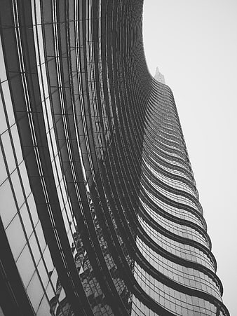
Black and white low angle view of twisting skyscraper facade -
aesthetic:82
2736x3648px
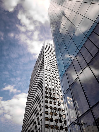
Low angle view of modern glass skyscrapers against blue sky -
aesthetic:82
3446x2297px
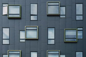
Modern gray building facade with geometric window pattern -
aesthetic:88
4624x3468px
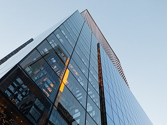
Low angle view of modern glass skyscraper with sunset reflection -
aesthetic:88
4864x3648px
Low angle view of modern skyscrapers against blue sky -
aesthetic:84
3694x4926px
Low angle view of modern glass skyscraper reflecting blue sky -
aesthetic:75
4576x3051px
Low angle view of modern glass office building facade -
aesthetic:88
3200x2368px
Modern Architecture with Sky Reflection in Glass Windows -
aesthetic:88
6000x4000px
Low angle view of modern skyscraper against blue sky -
aesthetic:83
5184x3888px
Low angle view of modern glass and concrete architecture -
aesthetic:90
4095x2756px
Modern Colorful Building Facade Against Blue Sky -
aesthetic:85
2736x1824px
Low angle view of modern skyscraper against cloudy sky -
aesthetic:85
4684x3112px
Abstract Blue Glass Building Facade with Diagonal White Reflection -
aesthetic:83
3887x5183px
Low angle view of modern glass cube architecture -
aesthetic:88
2560x1707px
Abstract geometric view of modern glass skyscraper architecture -
aesthetic:82
5472x3648px
Black and white low angle view of urban skyscrapers -
aesthetic:85
6000x4000px
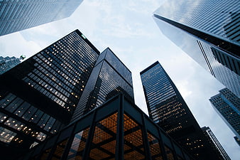
Low angle view of modern skyscrapers in a city -
aesthetic:80
2509x1673px
Modern glass office building facade with blurred interior view -
aesthetic:78
4819x3213px
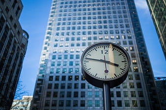
Street Clock in Front of Modern Skyscraper -
aesthetic:82
4725x3140px
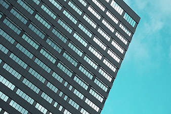
Modern Office Building Facade with Blue Sky Background -
aesthetic:80
5760x3840px
Low angle view of modern office buildings against blue sky -
aesthetic:82
5104x3828px
Low angle black and white modern building architecture -
aesthetic:78
4032x3024px
Modern Office Building Exterior with Blue Sky Background -
aesthetic:88
4800x3200px
Low angle view of tall skyscraper against blue sky -
aesthetic:88
4721x3137px
Modern white building facade against blue sky -
aesthetic:82
4734x3145px
Modern white office building with blue glass windows against sky -
aesthetic:82
3648x2433px
Low angle view of modern glass skyscraper against blue sky -
aesthetic:88
6000x4000px
Low angle view of modern glass skyscraper against blue sky -
aesthetic:82
4548x2558px
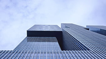
Low angle view of modern glass skyscrapers against cloudy sky -
aesthetic:74
2048x1304px
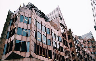
Low angle view of modern brown stone office building -
aesthetic:82
4876x2742px
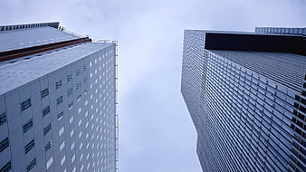
Low angle view of modern skyscrapers against cloudy sky -
aesthetic:80
3319x2489px
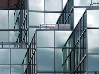
Modern Glass Office Building Architecture with Cloud Reflections -
aesthetic:82
4820x3203px
Low angle view of modern glass skyscraper against blue sky -
aesthetic:88
4000x4000px

Low angle view of modern glass skyscrapers against white sky -
aesthetic:90
4871x3237px
Modern white geometric building with circular cutouts against blue sky -
aesthetic:78
6000x4000px
Low angle view of modern glass and steel architecture against blue sky -
aesthetic:82
3264x2448px
Low angle view of modern glass skyscrapers in urban city -
aesthetic:88
5184x3456px
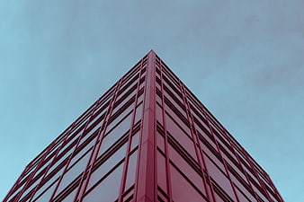
Low angle view of red modern skyscraper against blue sky -
aesthetic:83
4032x3024px
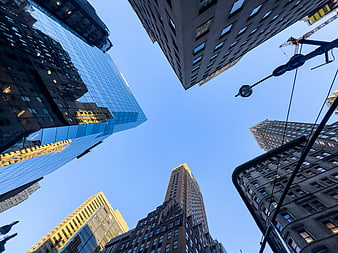
Low angle view of skyscrapers against blue sky -
aesthetic:82
3591x4788px
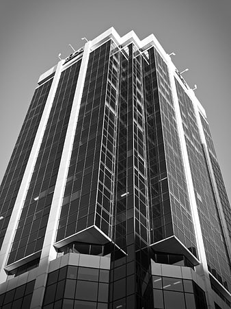
Low angle black and white modern skyscraper architecture -
aesthetic:80
3200x2368px
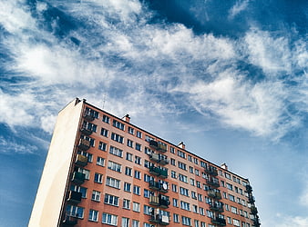
Low angle view of orange apartment building against blue sky