
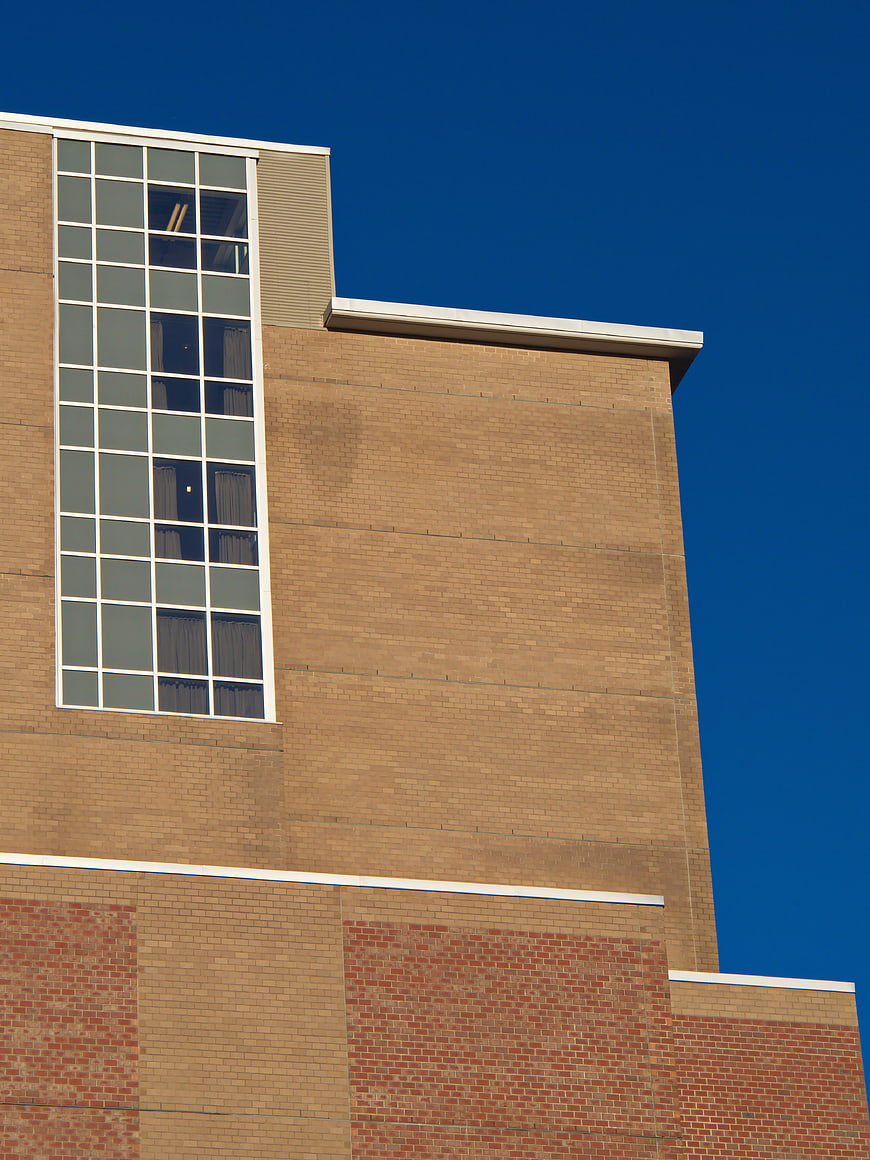
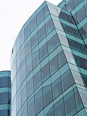
A low-angle architectural shot of a modern brick building featuring a tall, grid-patterned window and clean geometric lines set against a deep blue sky. Ideal for urban design, construction, and corporate backgrounds.
Tags:
PHOTO INFO
- Image Size
- 3302x4403px
- File Size
- 2.74MB
- resolution
- 4K
- License
- Commercial use free
- Aesthetic Score
- 76/100
VISUAL ATTRIBUTES OF THIS STOCK PHOTO
- Color temperature
- cool
- Brightness
- mid_tone
- Saturation
- vibrant
- Lighting Source
- natural
- Lighting Condition
- midday
- Negative Space
- moderate
- Negative Space Location
- top_right
- Depth Of Field
- deep
- Has People
- none
- Season
- unknown
- Time Of Day
- afternoon
- Shot Scale
- wide
- Background Type
- clean
- Orientation
- vertical
- Composition Style
- diagonalleading_lines
- Dominant colors
- bluebrownredwhite
- Palette Style
- naturalvibrant
- Mood
- professionalcalm
- Style
- architecturalmodern
- Subject type
- architecturebuilding
aesthetic analysis & score
This is a strong, clean architectural image with excellent color contrast and sharp technical quality, making it highly usable for design and corporate contexts despite its somewhat generic subject matter.
Composition & Framing
75The strong geometric lines and low-angle perspective create a solid, structured composition that emphasizes the building's height.
Lighting & exposure
80Bright, even daylight illuminates the brick texture clearly while maintaining deep, rich tones in the sky without harsh overexposure.
Color harmony & palette
85The complementary contrast between the warm tan and red bricks and the deep, saturated blue sky creates a visually striking and harmonious palette.
Visual impact & mood
70The image conveys a sense of stability and modernity, though the subject matter is somewhat utilitarian and lacks emotional depth.
Technical Quality & Clarity
82The image is sharp with excellent detail in the brickwork and window grid, showing high technical execution.
Subject clarity & focal hierarchy
80The tall window acts as a clear focal point, drawing the eye upward along the vertical lines of the structure.
Use case suitability scores
Copyspace Layout Usability
85This image is suitable for text overlay layouts — the negative space in the top_right works for posters, banners, greeting cards and magazine covers needing headline room
Social Media Content Creation
60Web UI Digital Design
75Commercial Advertising Branding
70Editorial Corporate Presentation
80Content Marketing Publishing
75Ecommerce Product Showcase
40Market Competitiveness
72Related Royalty free Photos
-
aesthetic:82
3648x5472px
Low angle view of red brick building corner with curved windows -
aesthetic:88
2609x3478px
Modern wooden building facade against blue sky -
aesthetic:72
4543x3407px
Modern gray building facade with black windows -
aesthetic:82
3591x4788px
Low angle black and white modern skyscraper architecture -
aesthetic:78
4812x3612px
Modern Building Corner with Decorative Brick Facade -
aesthetic:82
5184x3888px
Modern Glass Skyscraper Architecture with Blue Sky Reflection -
aesthetic:82
5104x3828px
Low angle black and white modern building architecture -
aesthetic:78
3873x5166px
Low angle view of modern office building facade -
aesthetic:82
6000x4000px
Low angle view of modern brick apartment building facade -
aesthetic:80
4066x2632px
Low angle view of red brick industrial building facade -
aesthetic:88
6000x4000px
Low angle view of modern glass skyscraper against blue sky -
aesthetic:85
5184x3888px
Modern White Building Facade Against Blue Sky -
aesthetic:82
6000x4000px
Low angle view of modern glass skyscrapers against blue sky -
aesthetic:88
4460x2973px
Modern triangular architectural structure with metal and glass -
aesthetic:88
4624x3468px
Low angle view of modern glass skyscraper with sunset reflection -
aesthetic:84
3694x4926px
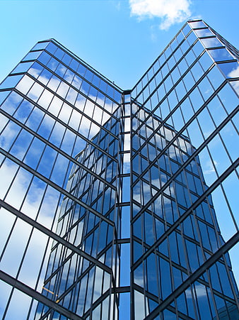
Low angle view of modern glass skyscraper reflecting blue sky -
aesthetic:82
4000x6000px
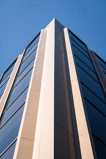
Low angle view of modern office building corner against blue sky -
aesthetic:88
3648x5472px
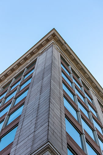
Low angle view of modern office building corner against blue sky -
aesthetic:85
4684x3112px
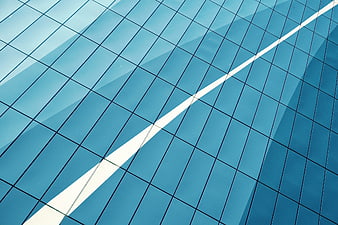
Abstract Blue Glass Building Facade with Diagonal White Reflection -
aesthetic:84
4667x3500px
Modern architectural corner detail in black and white -
aesthetic:80
5183x3887px
Modern Glass Office Building Facade Against Blue Sky -
aesthetic:76
3670x2753px
Modern building facade with blue glass windows and brown panels -
aesthetic:68
4000x3000px
Low angle view of modern office building facade -
aesthetic:85
5446x3063px
Low angle view of modern skyscraper against blue sky -
aesthetic:88
4732x3549px
Modern building facade against blue sky with clouds -
aesthetic:68
5183x3887px
Low angle view of modern brown office building facade -
aesthetic:84
4464x3348px
Modern Glass Office Building Architecture at Dusk -
aesthetic:75
5183x3887px
Modern industrial building facade with blue sky background -
aesthetic:78
3000x2000px
Modern Concrete Office Building Facade with Geometric Windows -
aesthetic:88
6000x4000px
Low angle view of modern skyscraper against blue sky -
aesthetic:90
5184x3456px
Abstract White Wavy Modern Building Facade Architecture -
aesthetic:82
3424x4565px
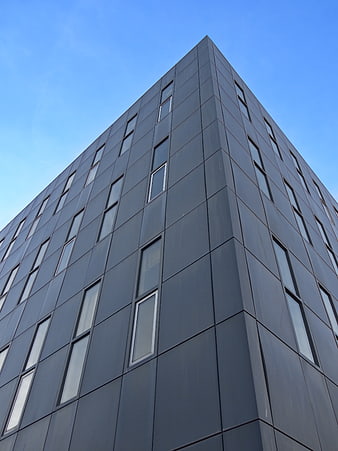
Modern Dark Gray Office Building Facade Against Blue Sky -
aesthetic:82
4508x3005px
Low angle view of modern glass skyscraper reflecting clouds -
aesthetic:78
4928x3264px
Low angle view of modern skyscraper architecture against blue sky -
aesthetic:80
8101x5197px
Modern Brick and Glass Office Building Facade -
aesthetic:85
5184x3888px
Curved Glass Building Facade Reflecting Blue Sky and Clouds -
aesthetic:88
3200x2368px
Modern Architecture with Sky Reflection in Glass Windows -
aesthetic:78
5182x3086px
Modern Building Facade with Geometric Windows and Blue Sky -
aesthetic:88
3501x4667px
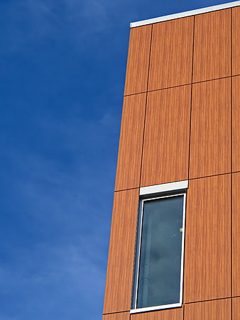
Modern wooden facade building against blue sky -
aesthetic:84
5472x3648px
Low angle view of modern glass skyscrapers against blue sky -
aesthetic:82
4395x3297px
Modern Red Brick Building Facade with Large Glass Windows -
aesthetic:85
4591x3443px
Modern Brick and Glass Building Facade Against Blue Sky -
aesthetic:82
4000x6000px
Low angle view of modern skyscrapers against blue sky -
aesthetic:84
1929x1446px
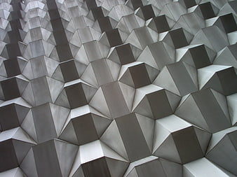
Abstract Geometric Metal Facade Pattern -
aesthetic:82
5717x3811px
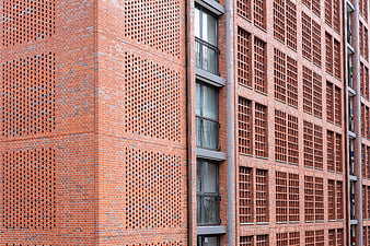
Modern Red Brick Building Facade with Geometric Patterns -
aesthetic:78
2429x3239px
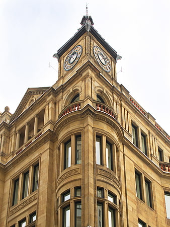
Low angle view of historic sandstone clock tower architecture -
aesthetic:78
5388x3592px
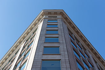
Low angle view of modern office building facade against blue sky -
aesthetic:82
5908x3939px
Low angle view of modern glass office building facade -
aesthetic:72
5184x3888px
Low angle view of modern glass building facade against gray sky -
aesthetic:82
3905x5858px
Modern Apartment Building Exterior with Blue Sky -
aesthetic:83
3968x2232px
Low angle view of modern glass skyscraper and curved building -
aesthetic:76
5184x3888px
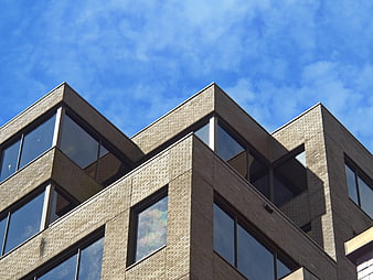
Modern Brick Office Building Exterior with Blue Sky -
aesthetic:82
3286x4381px
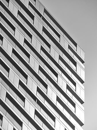
Modern Black and White Architectural Facade Pattern -
aesthetic:90
4095x2756px
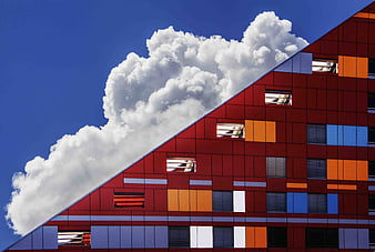
Modern Colorful Building Facade Against Blue Sky -
aesthetic:72
5472x3648px
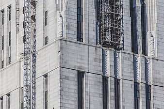
Modern gray stone building facade with scaffolding and geometric patterns -
aesthetic:72
3000x1964px
Modern brick apartment building facade with balconies -
aesthetic:86
4411x3313px
Modern Glass Office Building Facade Against Blue Sky -
aesthetic:78
4460x2974px
Modern Curved Glass Office Building Architecture -
aesthetic:82
3072x2048px
Low angle view of modern skyscrapers against blue sky -
aesthetic:84
3402x4536px
Modern Glass Skyscraper Architecture Detail