
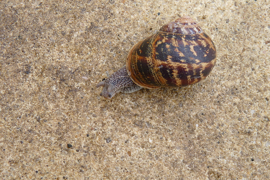
A detailed close-up view of a large garden snail with a brown and tan patterned shell crawling across a textured concrete surface. The image captures the intricate details of the snail's body and shell against a neutral background.
Tags:
PHOTO INFO
- Image Size
- 3264x2176px
- File Size
- 1.3MB
- resolution
- 2K
- License
- Commercial use free
- Aesthetic Score
- 72/100
VISUAL ATTRIBUTES OF THIS STOCK PHOTO
- Color temperature
- neutral
- Brightness
- mid_tone
- Saturation
- moderate
- Lighting Source
- natural
- Lighting Condition
- overcast
- Negative Space
- large
- Negative Space Location
- bottom_left
- Depth Of Field
- medium
- Has People
- none
- Season
- unknown
- Time Of Day
- unknown
- Shot Scale
- close_up
- Background Type
- textured
- Orientation
- horizontal
- Composition Style
- rule_of_thirds
- Dominant colors
- brownbeigegray
- Palette Style
- naturalearthy
- Mood
- calmnatural
- Style
- documentarynature
- Subject type
- animalsnail
aesthetic analysis & score
This is a high-quality, well-composed macro shot that effectively captures the details of a common garden snail, making it a solid choice for nature or texture-related content.
Composition & Framing
75The subject is well-placed using the rule of thirds, providing ample negative space for text or design elements.
Lighting & exposure
80Even, diffused lighting illuminates the subject clearly without harsh shadows or blown-out highlights.
Color harmony & palette
70The earthy tones of the snail's shell blend naturally with the neutral beige and gray of the concrete background.
Visual impact & mood
65The image is visually interesting due to the texture and pattern of the snail, though the subject matter is common.
Technical Quality & Clarity
85The image is sharp and detailed, capturing the texture of the shell and the snail's skin effectively.
Subject clarity & focal hierarchy
90The snail is the clear focal point, standing out distinctly against the uniform background.
Use case suitability scores
Copyspace Layout Usability
85This image is suitable for text overlay layouts — the negative space in the bottom_left works for posters, banners, greeting cards and magazine covers needing headline room
Social Media Content Creation
60Web UI Digital Design
70Commercial Advertising Branding
50Editorial Corporate Presentation
65Content Marketing Publishing
75Ecommerce Product Showcase
40Market Competitiveness
65Related Royalty free Photos
-
aesthetic:85
1920x1150px
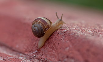
Close-up of a snail crawling on a red brick surface -
aesthetic:85
5274x3517px
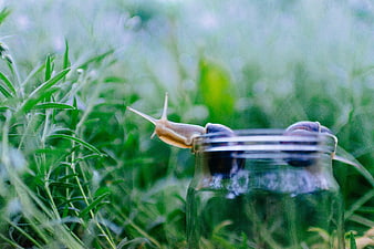
Snail Climbing Out of Glass Jar in Green Grass -
aesthetic:85
5456x3632px
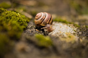
Close-up of a snail crawling on mossy ground -
aesthetic:85
6000x4000px
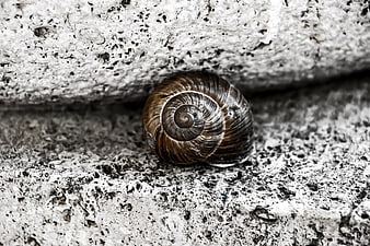
Close-up of a brown snail shell on textured concrete -
aesthetic:85
4000x2251px
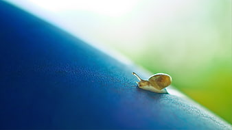
Tiny Snail Crawling on Blue Surface with Green Background -
aesthetic:82
3200x1803px
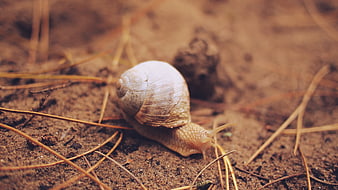
Close-up of a snail crawling on soil with pine needles -
aesthetic:82
4272x2848px
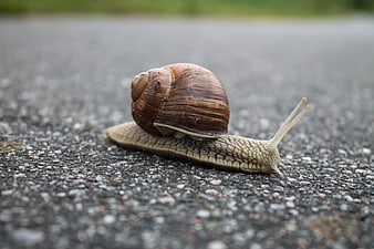
Close-up of a snail crawling on asphalt road -
aesthetic:82
2358x1576px
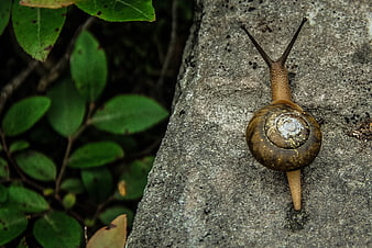
Close-up of a brown snail crawling on a textured gray rock -
aesthetic:85
8746x4704px
Snail crawling on wet blue wooden planks in nature -
aesthetic:82
6943x4634px

Close-up of a garden snail crawling on dark soil -
aesthetic:85
4608x3456px
Close-up of a spiral seashell on a pebble beach with blurred ocean background -
aesthetic:85
6000x4000px
Macro shot of a snail with a ladybug on its shell in green grass -
aesthetic:82
4115x2739px
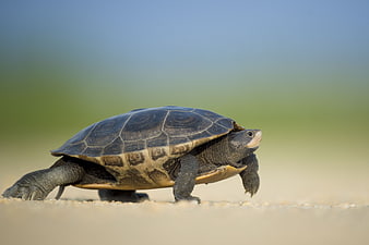
Side view of a turtle walking on sand with blurred background -
aesthetic:88
4631x2998px
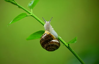
Close-up of a snail climbing a green plant stem -
aesthetic:88
4608x3072px
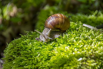
Close-up of a snail crawling on vibrant green moss -
aesthetic:82
5184x3888px
Close-up black and white texture of a spiral snail shell -
aesthetic:90
4450x2962px
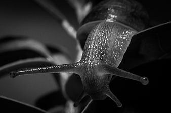
Close-up black and white macro photo of a snail on a leaf -
aesthetic:82
3888x2592px
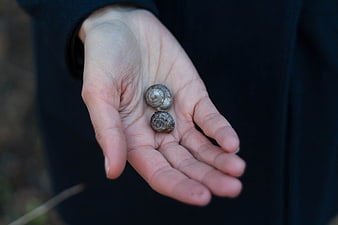
Two small snail shells resting in an open human palm -
aesthetic:84
4272x2848px
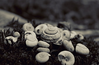
Monochrome macro of snail shells on mossy ground -
aesthetic:78
5184x3888px
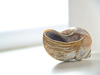
Close-up of a textured spiral seashell on a white surface -
aesthetic:85
4147x2760px
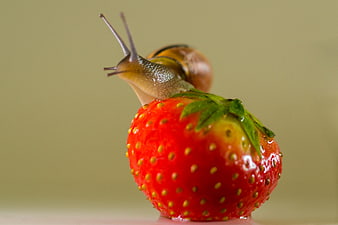
Close-up of a snail crawling on a fresh red strawberry -
aesthetic:85
4714x3143px
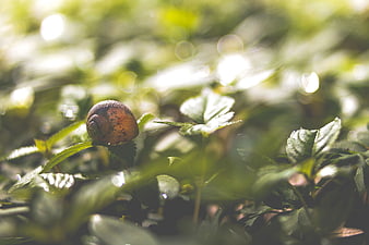
Close-up of a snail on green leaves with bokeh background -
aesthetic:82
4272x2848px
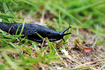
Close-up of a black slug crawling on wet grass -
aesthetic:90
3888x2592px
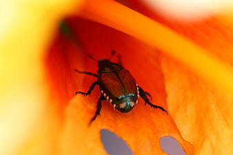
Macro shot of iridescent beetle on orange flower petal -
aesthetic:86
1663x2229px
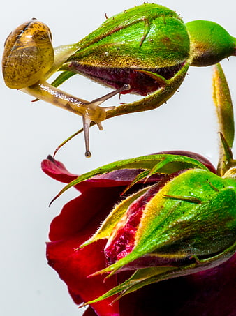
Macro Snail on Red Rose Bud -
aesthetic:82
4750x3167px
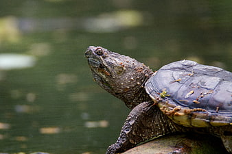
Close-up of a Snapping Turtle on a Log in Water -
aesthetic:85
3008x2000px
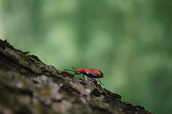
Red Beetle on Tree Bark with Green Background -
aesthetic:85
4484x2990px
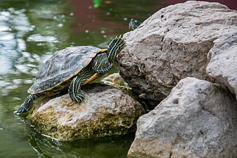
Red-eared slider turtle climbing on rocks in pond -
aesthetic:85
1920x1280px
Hand holding seashell on tropical beach with ocean background -
aesthetic:82
3872x2592px
Close-up texture of raw peanuts in shells -
aesthetic:93
1920x1280px
Close-up Black and White Elephant Eye and Skin Texture -
aesthetic:85
3549x2357px
Close-up of a snail on a vibrant red and yellow flower bud -
aesthetic:82
5184x3456px
Close-up of Giraffe Neck Texture and Pattern -
aesthetic:85
3568x2368px
Close-up of seashells on sandy beach with blurred ocean background -
aesthetic:85
4153x3107px
Close-up of a Red Ladybug on Weathered Wood -
aesthetic:86
3502x2166px
Macro of Colorful Snail Shell on Green Leaf -
aesthetic:90
6000x4000px
Close-up of vibrant orange flower with water droplets -
aesthetic:70
3000x2250px
Autumn maple leaves on textured concrete background -
aesthetic:80
5472x3648px
Close-up of seashells on sandy beach with sunlight -
aesthetic:82
5616x3744px
Green sea urchin shell on pebbled beach -
aesthetic:82
2908x1937px
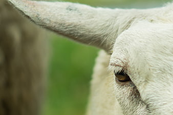
Close-up of a white sheep's eye and ear -
aesthetic:85
3655x2366px
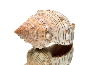
Detailed Macro of Striped Seashell with Reflection on White -
aesthetic:78
3456x2304px
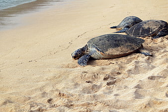
Sea Turtles Resting on Sandy Beach Shoreline -
aesthetic:86
3200x2134px
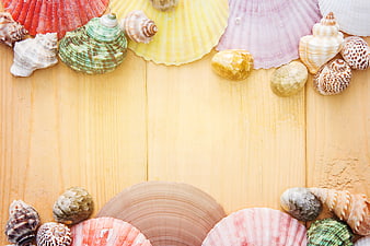
Colorful Seashells Arranged on Wooden Background -
aesthetic:85
6016x4000px
Garden Spider on Web with Blurred Background -
aesthetic:82
4106x2806px

Extreme Close-Up of a Cat's Nose and Fur Texture -
aesthetic:70
5472x3648px
Green garden hose on concrete background -
aesthetic:82
6000x4000px
Macro Close-Up of Brown Garden Spider on Web -
aesthetic:82
3840x2560px
Close-up of a turtle swimming in shallow water -
aesthetic:85
5472x3648px

Close-up of a white dahlia flower with soft pink center -
aesthetic:88
6000x4000px
Close-up of vibrant green Solomon's seal leaves with soft focus background -
aesthetic:88
4000x2604px
Close-up of a cat's green eye and pink nose -
aesthetic:85
5103x3402px
Close-up of Pink Zinnia Flower with Yellow Center -
aesthetic:90
4864x3648px
Close-up of a delicate pink rose in a garden -
aesthetic:78
4106x2806px

Extreme Close-Up of a Cat's Nose and Fur Texture -
aesthetic:82
3859x2573px
Close-up texture of roasted pistachio nuts in shell -
aesthetic:85
3888x2592px
Close-up of a vibrant red poppy flower with detailed center -
aesthetic:90
6000x4000px
Close-up of a vibrant peacock feather eye on a blurred background -
aesthetic:82
5472x3078px
Close-up of curious pig resting on concrete farm wall -
aesthetic:91
4914x3276px
Close-up of Pink Zinnia Flower with Yellow Center